Webinars are a big deal when it comes to getting new clients. They’re a great way to connect with people and show what you’ve got to offer.
According to themeisle, landing pages promoting webinars have the highest conversion rate at 22.84%
This impressive statistic highlights a well-crafted webinar landing page’s critical role in attracting attendees. It’s super important because it’s the first thing people see, and it’s what convinces them to join in.
In this article, you’ll explore the top 10 webinar landing page examples. These aren’t just any examples; they’re some of the best out there. They’ll give you great ideas on how to create a landing page for your webinar that attracts more sign-ups.
So, Let’s get started,
What is a Webinar Landing Page?
A webinar landing page is a dedicated web page designed specifically to describe your upcoming webinar and encourage people to sign up. This page includes key details like:
- reasons to join the webinar,
- what the webinar is about,
- who’s hosting it,
- and when it’s happening.
In short, It’s all about making a great first impression and giving you just enough information to click that ‘Register‘ button.
Importance of An On-demand Webinar Landing Page
Now, why put so much effort into a webinar landing page? Here are a few reasons:
- Increases Sign-Ups: A clear, compelling landing page directly leads to more people signing up. It’s your pitch to convince them why they should spend their time on your webinar.
- Targets the Right Attendees: With the right content and design, your landing page will attract the audience who will most benefit from and engage with your webinar’s topic.
- Streamlines Registration: A well-designed landing page makes the sign-up process easy, reducing the chances of potential attendees dropping off before registering.
- Enhances Marketing Efforts: Your landing page is a vital tool in your marketing arsenal. It’s where you can track visitor data, see what’s working, and tweak your approach to improve sign-ups.
- Sets Expectations: A good landing page clearly outlines what attendees will learn and gain from your webinar, setting the right expectations and building excitement.
Key Elements of an Effective Webinar Landing Page
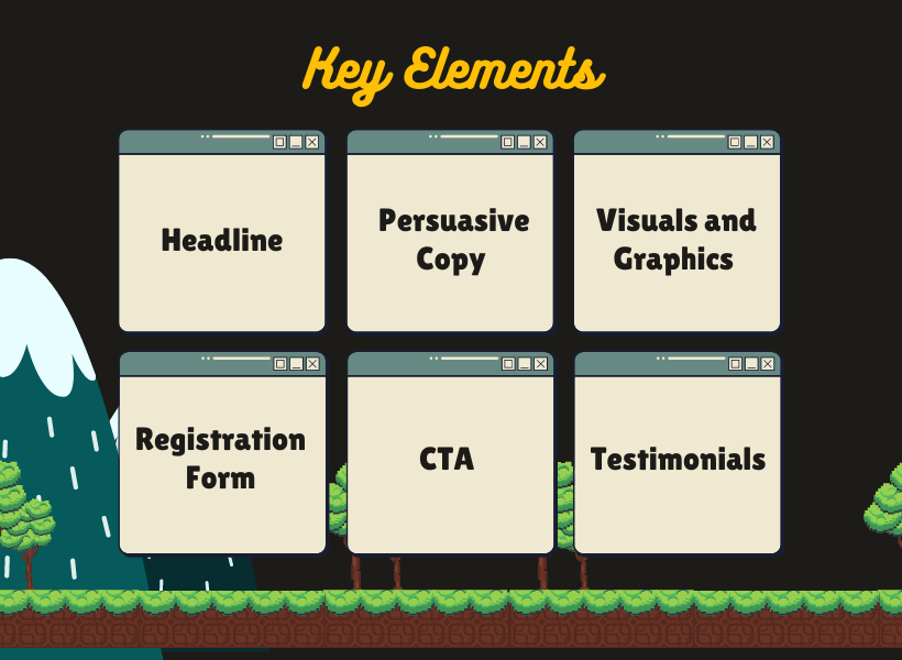
First thing first, creating a webinar landing page copy that converts visitors into registrants isn’t just about good looks; it’s about a planned structure.
Here are the essential elements you need to include to make your page effective:
1. Compelling Headline
You need to start the webinar funnel with an attention-grabbing element – a headline that captivates the visitor instantly.
The headline must include some element of interest for your target audience, usually the end goal they want to achieve. This headline should express that the prospect can achieve the goal easily by joining this webinar.
Take, for instance, a webinar about improving digital marketing skills. A headline like “Boost Your Digital Marketing Skills in Just One Hour” is straightforward and to the point. It tells your audience exactly what they will learn and the time commitment involved, making it clear and appealing. The main highlight here is “Just One Hour”. You see, digital marketing courses are available everywhere, but it’s a hassle to spend so much time in learning. But to be able to learn it in one hour? Now that’s somthing anyone would want.
This approach ensures your headline resonates with the audience’s needs and interests. It helps to encourage them to read on and ultimately register.
2. Benefit-focused Persuasive Copy
After your headline has caught the attention of your audience, the next step is to keep them engaged with benefit-focused persuasive copy. This is where you highlight what attendees will gain from your webinar.
The key is to focus on benefits, not just features. It’s not just about what you’ll cover in the webinar; it’s about how it will help your audience.
For instance, if your webinar is about mastering time management, don’t just list the agenda. Instead, paint a picture of how this knowledge will transform their daily routine.So, if one of the topics is “Planning An Hourly Routine,” copy should convey it’s benefit such as “Hourly Routine Planning Minimize Time Wasting.” This will indicate that people will be able to reduce the amount of time wasted.
This will help to directly connect the webinar’s content with satisfying outcomes for your audience. It’s about showing them the positive changes they’ll experience in their personal and professional lives by attending your webinar.
3. Engaging Visuals and Graphics
Besides the copy, your webinar landing page also needs to be visually appealing, while staying relevant to the topic.
Imagine your webinar is about innovative gardening techniques. Including images of vibrant gardens or infographics showing gardening tips can instantly make your page more engaging. These visuals serve a dual purpose:
- They break up long stretches of text, making your page easier to read,
- They provide a quick, visual representation of your webinar’s content.
This visual storytelling can help your audience understand at a glance what they’ll gain from attending your webinar, enhancing their overall experience on your landing page.
4. Clear and Persuasive Call-to-Action (CTA)
After attracting your audience with engaging visuals, the next crucial element is your Call-to-Action (CTA). This is the part where you prompt your visitors to take the desired action – in this case, to register for your webinar.
For example, if your webinar is about mastering digital photography, your CTA can be “Reserve Your Spot to Master Photography Now!” This CTA is direct and tells your audience exactly what they need to do and what they will gain.
The right CTA can push uncertain visitors to take action.
5. Registration Form Optimization
Now, you have convinced your visitors that your webinar is worth their time and they are ready to register. But it’s best not to take any chances and keep the registration form as simplified and optimized as possible.
Create a form asking for only the virtual information you need to be able to plan a marketing strategy for them in the future. In most cases, only the email and name are enough. But you could add additional fields to your lead capture form to make it more personal.
For example, if it’s a webinar about money management, you can ask questions such as “Average monthly expenses” and “Average monthly income.” To avoid wasting time, you may include dropdown options with a range of amounts for faster completion.
However, as mentioned, only collect this extra data if you have some sort of marketing funnel in place after the webinar. The main goal here is to get registrations, not a survey.
Another important detail you need to keep around the registration form is the time and date when this webinar will be held. This will help the visitor decide if he/she will be available to attend on time. However, in most cases, you would also mention that even if they miss it, the recorded version will be sent to them via email.
6. Social Proof and Testimonials
Social proof and testimonials of your clients who worked with you on similar topics in the past can be used on the landing page to prove your credibility.
Even if your webinar topic is interesting and you promise a lot of benefits, people will still be skeptical. So, offering social proof will help to clear up some of the dilemmas.
However, make sure these testimonials are related to the webinar topic. You could be a digital marketing expert and know about both SMM and SEO.
But if the webinar is about SEO, highlighting testimonials about your prowess in SMM is not helpful here. Only present the ones that praise you as an SEO expert or a digital marketing expert with SEO prowess.
Importance of Good Webinar Landing Page Design
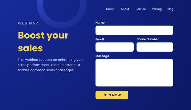
The design of your webinar landing page is a big deal for its success. A good design helps people find what they need and understand your webinar quickly.
A. Impact of Design on Conversion Rates
How your landing page looks can really change how many people sign up. A clear, easy-to-read layout with the right colors and text can draw people’s attention to the main points, like what your webinar is about and how they can join.
Simply put, if your page is too cluttered, people might leave without signing up. But if it’s neat, with clear headings and an easy-to-spot sign-up button, more people are likely to stay and register.
Best Practices for Layout and Aesthetics
Now, consider these specific and actionable best practices for an effective layout and aesthetics of your webinar landing page-
- Consistent Color Scheme: Choose a color scheme that reflects your brand and use it consistently throughout the page. This helps in creating a visually cohesive experience.
- Readable Fonts: Select fonts that are easy to read and use them consistently. Large headings and a clear font for body text ensure that your content is accessible to everyone.
- Strategic Placement of Key Elements: Place your headline, key benefits, and call-to-action button above the fold. This ensures they are seen immediately without scrolling.
- Use of Visual Hierarchy: Arrange elements in a way that guides the viewer’s eye through the content in a logical order, from the most important information to the call to action.
- Optimized Images and Graphics: Use high-resolution images and graphics that are relevant to your webinar topic. Ensure they are optimized for quick loading.
B. Mobile Responsiveness and Accessibility
Now, let’s talk about making your webinar landing page both mobile-responsive and accessible.
We all know that, in today’s world, a huge chunk of web traffic comes from mobile devices. That means your landing page needs to look good and work well on phones and tablets, not just on desktop computers. If your page doesn’t load properly or is hard to navigate on a mobile device, you might lose a lot of potential attendees.
Accessibility is also key. This means designing your page so everyone, including people with disabilities, can use it easily. Use clear, descriptive text for links and alt text for images.
Make sure your page can be navigated with a keyboard and that your content is structured in a way that screen readers can understand.
By focusing on mobile responsiveness and accessibility, you’re not just following best practices; you’re also showing that you care about all your potential attendees, no matter how they access your page.
Read this detailed guide- What Is a Landing Page? – A Complete Guide [2025]
10 Successful Webinar Landing Page Examples
Now, let’s explore ten standout webinar landing page examples. These webinar landing pages have proved to be very successful when it comes to getting more registration, not just for the topic, but also for the page design and structure.
We’ll break down what makes each one work so well. By looking at these real-life examples, you’ll get a clear idea of how to craft your own effective landing page.
Example 1 – Slack’s Webinar Landing Page For Improving Online Communication
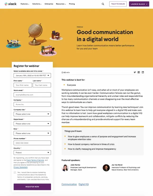
Overview Of Webinar Topic
This webinar focuses on sharpening your team’s online communication. It addresses common remote work challenges and shows you how to use Slack to improve team performance.
Best Elements Of This Landing Page:
- CTA Placement and Messaging: The ‘Register Now’ button stands out, placed where your eye naturally goes after reading about the webinar. It’s straightforward, telling you exactly what to do next.
- Unique Design Aspects: The page uses colorful and engaging graphics that reflect Slack’s brand and suggest that using their platform makes work fun and easy.
- Conversion Rate Optimization Techniques Used: The sign-up form is quick to fill out, asking only for essential information, which makes it more likely that visitors will complete it.
- Visual Content and Its Effectiveness: The graphics do more than just look good; they show what Slack is about—making teamwork smoother and more enjoyable.
Example 2 – GetResponse Webinar Registration on Google Ads
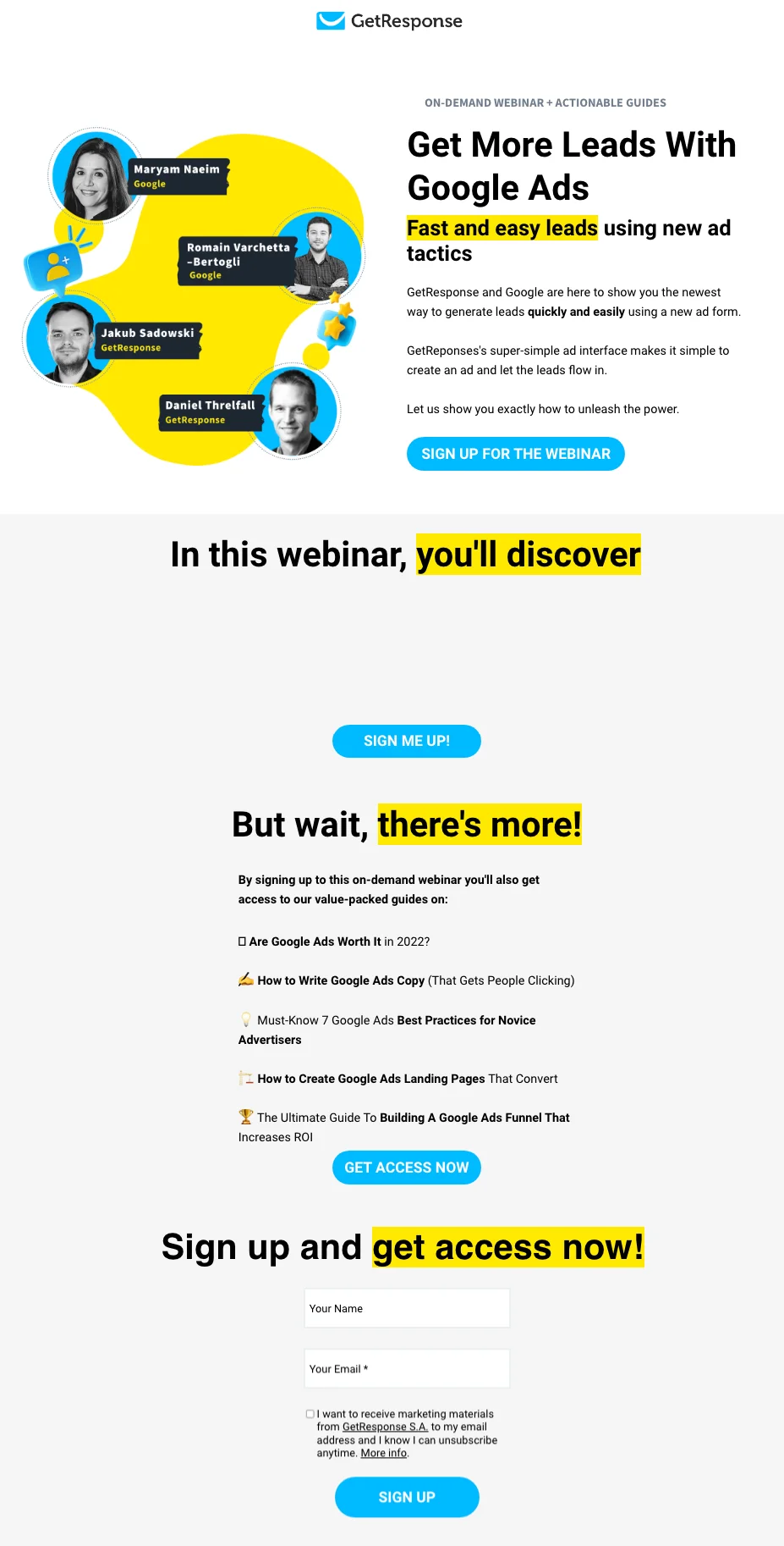
Overview Of Webinar Topic
This webinar is all about Google Ads and grabbing leads fast. You’ll learn new tactics that make ad creation a breeze. GetResponse teams up with Google to show you the ropes of generating leads effectively and efficiently.
Best Elements of This Landing Page
Now, let’s dive into the best elements of this landing page to understand what makes it so effective.
- Direct Headline: Right at the top, the headline ‘Get More Leads With Google Ads’ is a straight shooter. It tells you exactly what you’re there to learn, with no beating around the bush.
- Clear Benefits Listed: The page lays out the benefits you’ll get from the webinar, like quick lead generation landing page and easy ad creation.
- Bonus Material Offer: Besides the main event, the page offers more resources. Sign up and you get guides on Google Ads best practices and more, adding value to your click.
- Multiple CTAs: With ‘Sign Up’ buttons both at the top and bottom, you’re never too far from taking the next step.
- Visually Appealing Design: The design is crisp and clean, with bold colors that make the key points pop out. It’s easy on the eyes and easier on the mind, making your decision to sign up simple.
Example 3 – Sprout Social Webinar Landing Page For Influencers
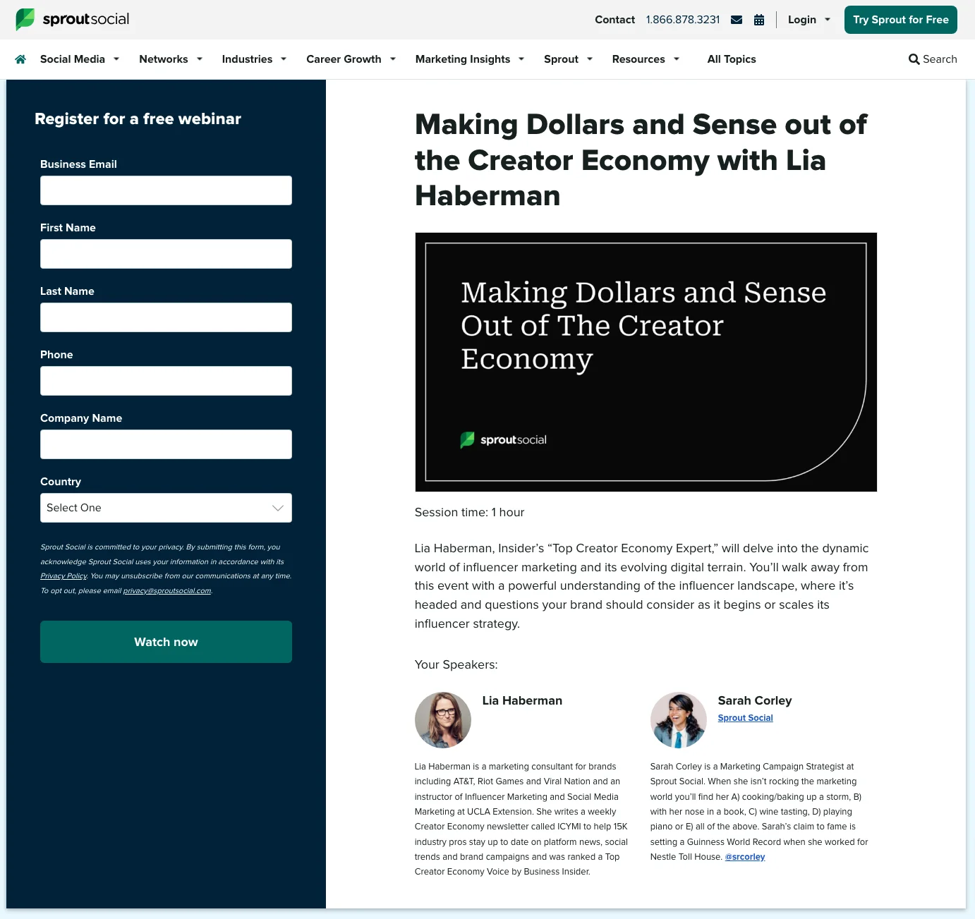
Overview Of Webinar Topic
This webinar landing page gears you up to dive into the influencer marketing world, with Lia Haberman, a seasoned expert, as your guide. You’ll come out with a fresh outlook on how influencers can shape your brand’s future.
Best Elements Of This Landing Page
- Focused Headline: The headline grabs your attention with the promise of merging creativity with profitability in the influencer realm. It’s clear and promises a deep understanding of the creator economy.
- Informative Speaker Bio: The page spotlights the speakers with bios that highlight their expertise, giving you confidence in the value of the information you’re about to receive.
- Clean Design: The design is clean and distraction-free, focusing your attention on what matters: the content and the experts.
- Easy Registration: The sign-up form is simple, asking for just the basics, making your path to registering for the webinar hassle-free.
Example 4 – Forecast’s Webinar On AI
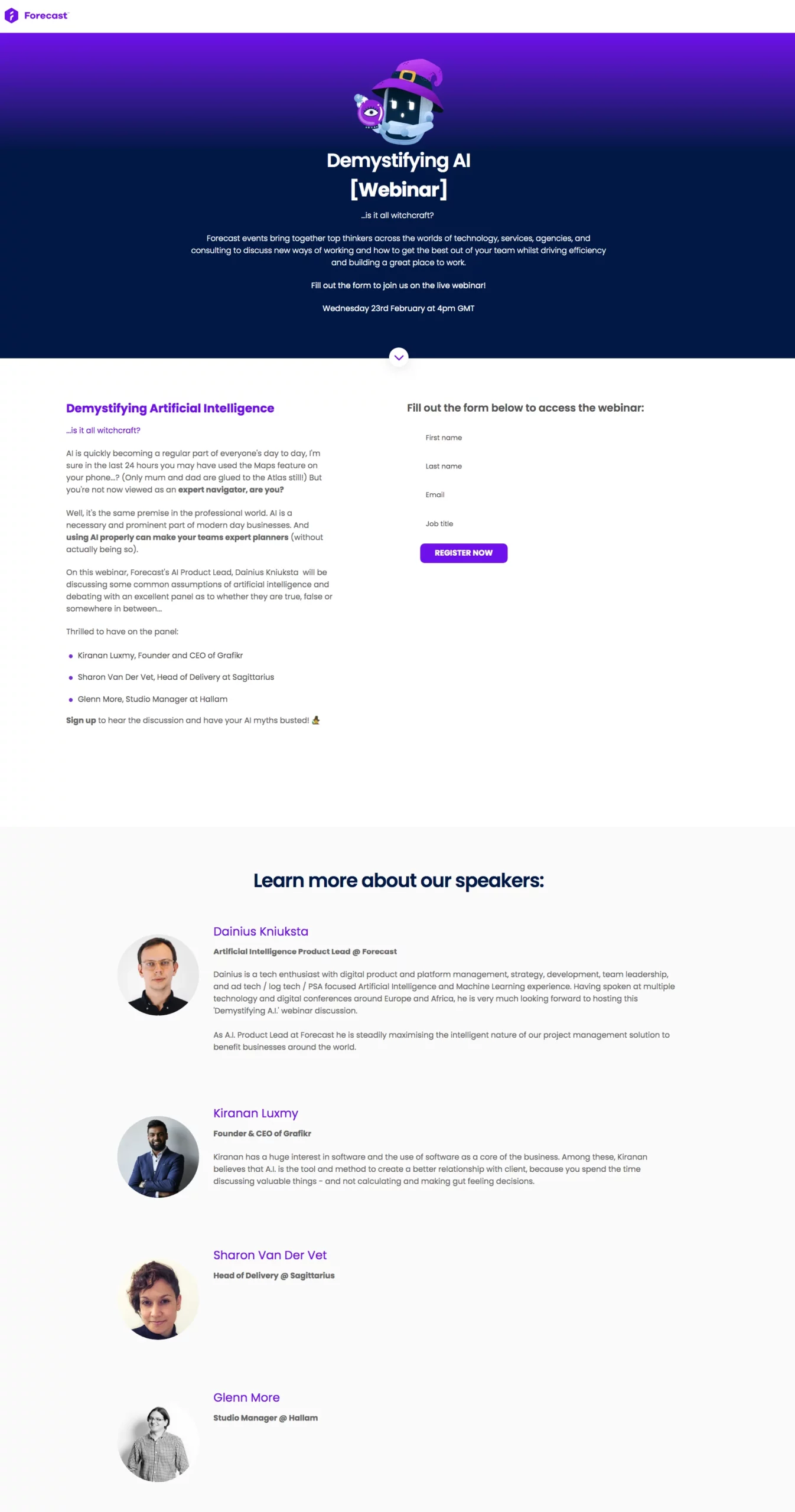
Overview Of Webinar Topic
This webinar is set to untwist the complexities of AI for you. You’ll explore how artificial intelligence can streamline your workday and make your team shine.
Best Elements Of This Landing Page
- Engaging Headline: “Demystifying AI” – the headline alone sets the stage for a session that will clarify AI in terms anyone can grasp.
- Speaker Credentials: The landing page shines a spotlight on the speakers with a clear rundown of their expertise, making it clear why they’re the ones to listen to.
- Visuals and Design: The page uses purple tones and crisp images that make it inviting and easy to navigate.
- Straightforward Sign-up: The sign-up process is smooth, with a form that’s right there on the page, ready for you to fill in and join the conversation.
Example 5 – Calendly’s Webinar About Retention
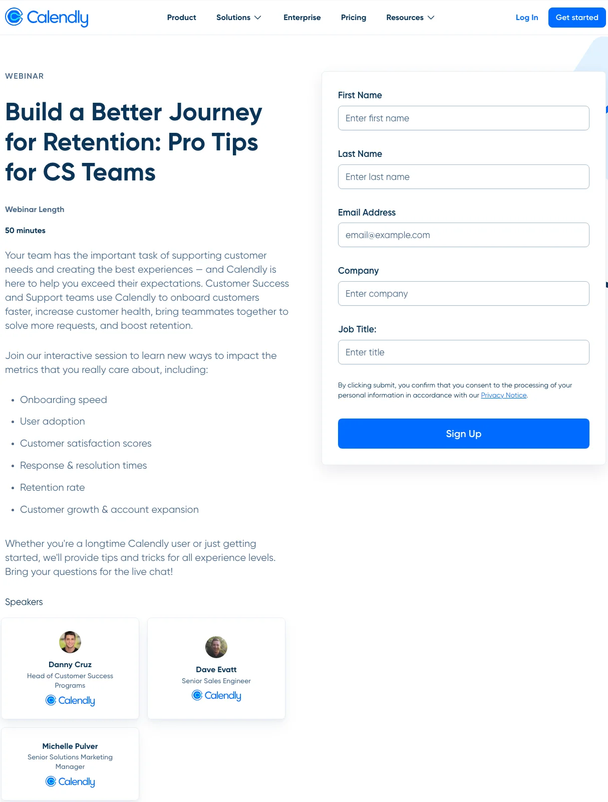
Overview Of Webinar Topic
In just 50 minutes, this webinar landing page aims to transform your approach to customer retention. You’ll get pro tips to make your CS strategy smoother, quicker, and more effective.
Best Elements Of This Landing Page
- Straight-to-the-Point Headline: The headline leaves no room for doubt. You’re here to learn, improve, and retain. It’s as simple as that.
- List of Takeaways: The page lists what you’ll learn, from onboarding to expansion. It’s clear, and direct, and promises tangible benefits.
- Expert Speakers: Calendly puts its own experts front and center, showing you the faces of those who’ll guide you through the retention journey.
- Simple Sign-Up Form: The form on the right asks for just the basics, making the step from interested to enrolled a breeze.
Example 6 Social Pilot’s Session On Marketing Agency Engagement Growth
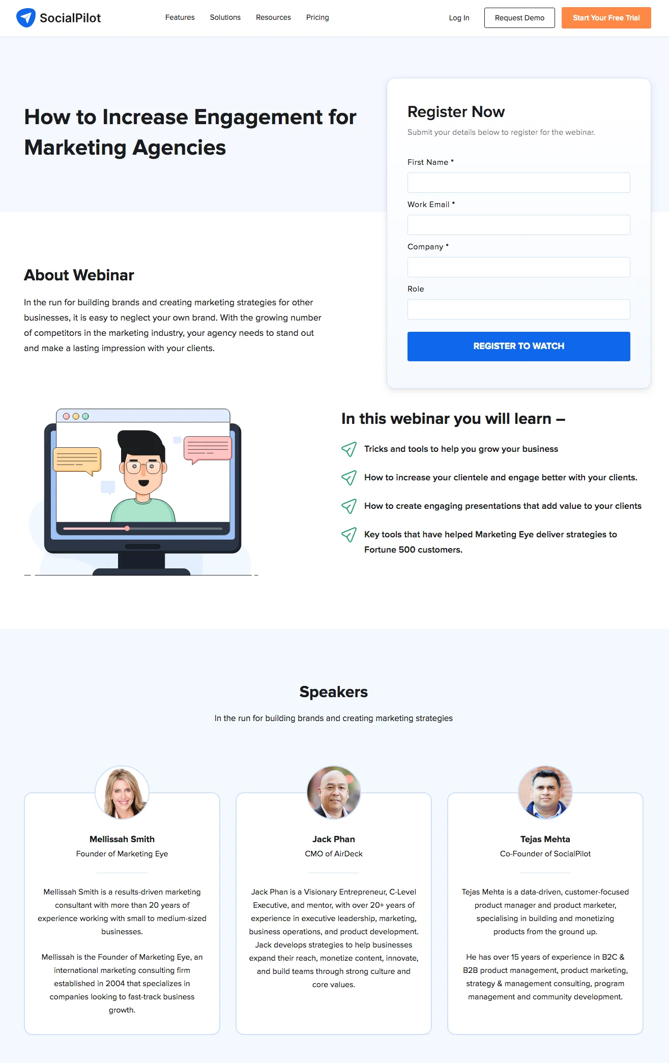
Overview Of Webinar Topic
This webinar centers on elevating your agency’s game. It’s about making your mark in a crowded field and leaving an impression that lasts well beyond the first campaign.
Best Elements Of This Landing Page
- Clear, Actionable Headline: The headline instantly tells you that this webinar is about growth, engagement, and retention. No fluff, just focus.
- Bullet-point Learning Objectives: Right off the bat, you know what you’ll gain: business growth tactics, client engagement strategies, and presentation skills to wow your audience.
- Credible Speaker Line-up: The speakers are industry veterans with years of marketing success, giving you confidence that you’re learning from the best.
- Streamlined Sign-up Process: The sign-up form is clean and uncluttered, respecting your time and making it easy to take the next step.
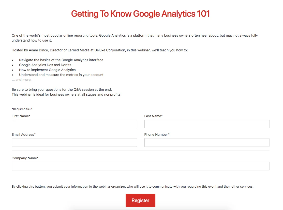
Example 7 – Deluxe Webinar On Google Analytics
Overview Of Webinar Topic
The webinar pledges to navigate the essentials of Google Analytics. It’s about giving you the skills to use this powerful tool to its full potential, making sure every click counts.
Best Elements Of This Landing Page
- Informative Outline: The page clearly outlines what you will learn, from the basics to measuring important metrics. It ensures you know exactly what knowledge you’re signing up for.
- Interactive Q&A Opportunity: It promises an interactive Q&A session, setting the stage for a two-way learning experience.
- Broad Appeal: The content is crafted for learners at all levels, stating this is the perfect learning opportunity for any stage of business or nonprofit operation.
- Simplified Registration: The registration form is straightforward, inviting you to quickly secure your spot without any hassle.
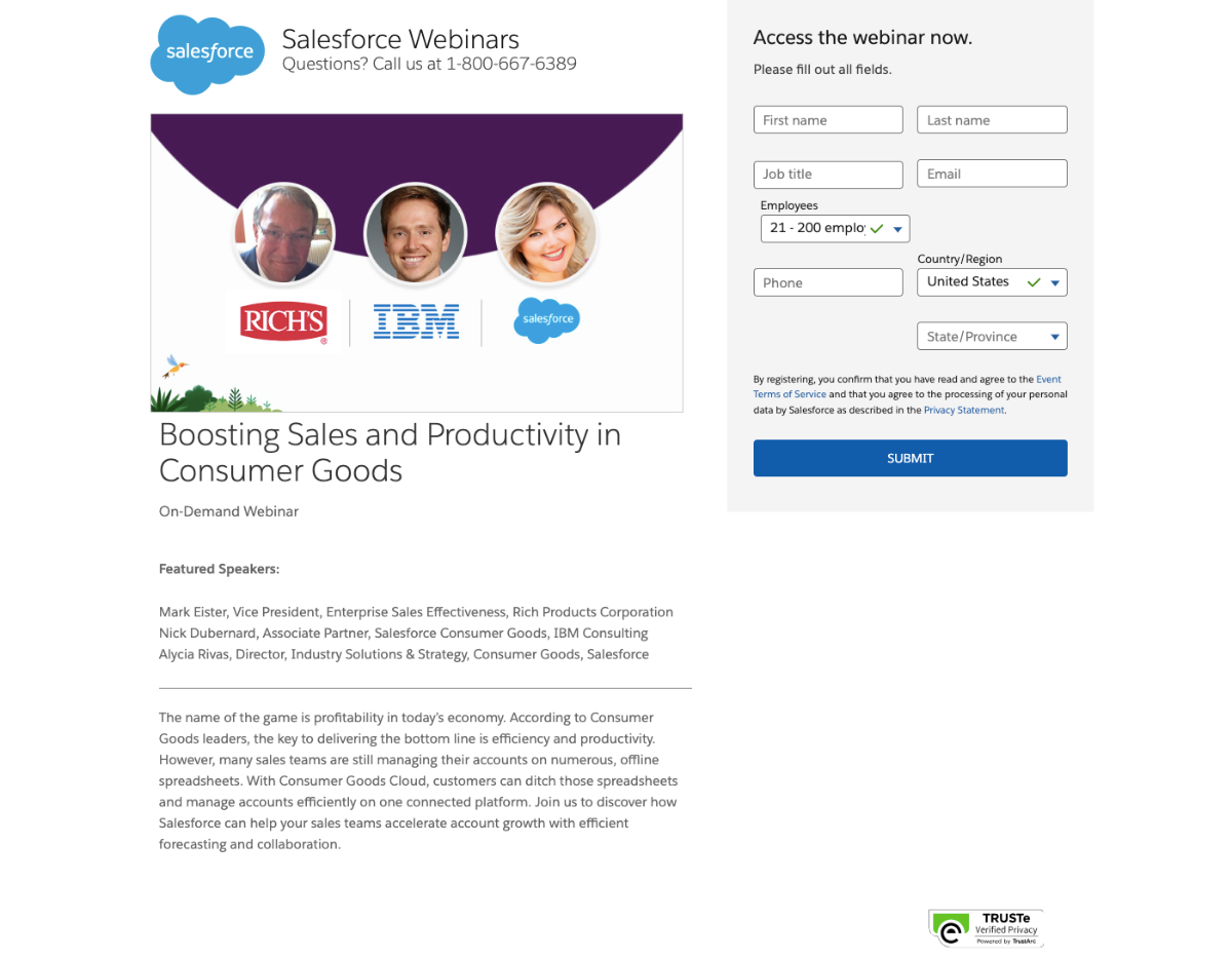
Example 8 – Salesforce’s Webinar Landing Page for Boosting Sales Performance
Overview Of Webinar Topic
This webinar example focuses on enhancing your sales performance using Salesforce. It tackles common sales challenges and demonstrates how to leverage Salesforce’s tools to close deals faster and more efficiently.
Best Elements Of This Landing Page:
- CTA Placement and Messaging: The ‘Sign Up Now’ button is prominently placed. it guides your eye naturally after you’ve read about the webinar. The messaging is clear and urgent, encouraging immediate action to secure your spot.
- Unique Design Aspects: The page features smart, professional design elements that reflect Salesforce’s brand. The use of dynamic visuals and concise body copy suggests that utilizing Salesforce can simplify your sales processes and drive success.
- Conversion Rate Optimization Techniques Used: The sign-up form is designed for conversion optimization. It requires only essential details like name, email address, and phone number. This simplicity increases the likelihood of webinar registrations.
- Visual Content and Its Effectiveness: The visual content is not just aesthetically pleasing but also functional. It provides a clear understanding of Salesforce’s benefits, making it easy for visitors to see the advantages of attending the webinar and using the platform.
By implementing these elements, Salesforce’s webinar landing page effectively attracts and converts visitors. It ensures high engagement and registration rates.
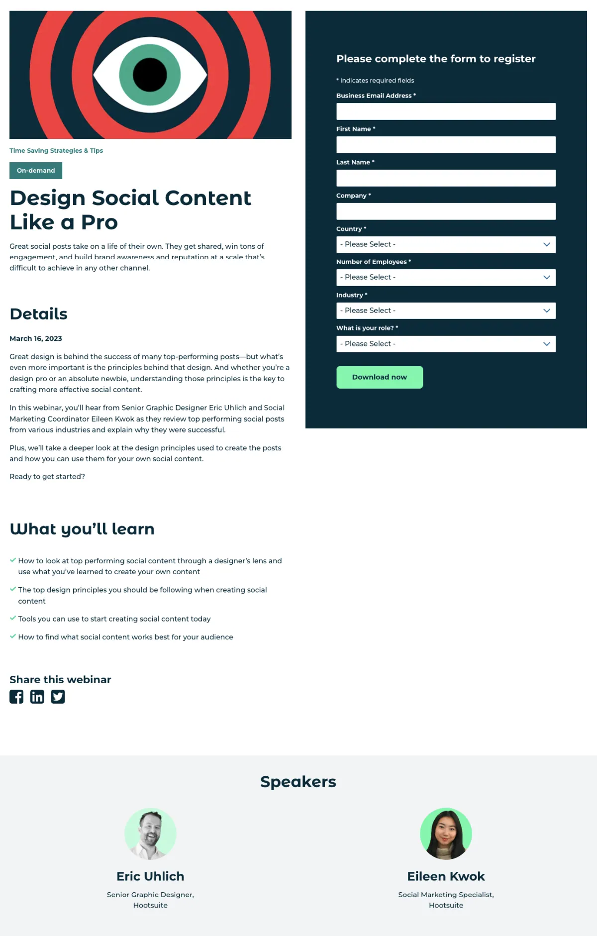
Example 9 – Hootsuite’s Webinar Landing Page for Mastering Social Media Strategy
Overview Of Webinar Topic
This webinar example centers on mastering social media strategy using Hootsuite. It addresses key challenges in managing social media accounts and shows how Hootsuite can help simplify your efforts to enhance engagement and growth.
Best Elements Of This Landing Page:
- CTA Placement and Messaging: The ‘Join Now’ button is strategically placed and clearly visible. It creates a sense of urgency. It also directs visitors towards immediate registration, making the specific action required obvious.
- Unique Design Aspects: The webinar landing page template uses Hootsuite’s branding colors and dynamic visuals, which generate visitors’ curiosity. The design is clean and professional. It helps to make it easy for visitors to focus on the webinar title and key benefits.
- Conversion Rate Optimization Techniques Used: The prominent form requires minimal visitor info, just the essentials like name and email address. This simplicity, along with bulleted copy highlights the clear value proposition. It increases the likelihood of webinar registrations.
- Visual Content and Its Effectiveness: The visuals are not just appealing but also informative. It provides relevant information about the webinar and how Hootsuite can improve social media management. This creates a clear understanding of what attendees can gain, driving higher engagement.
By incorporating these elements, Hootsuite’s webinar landing page effectively captures attention and converts visitors into registrants, showcasing a high-performing landing page for webinar registrations.
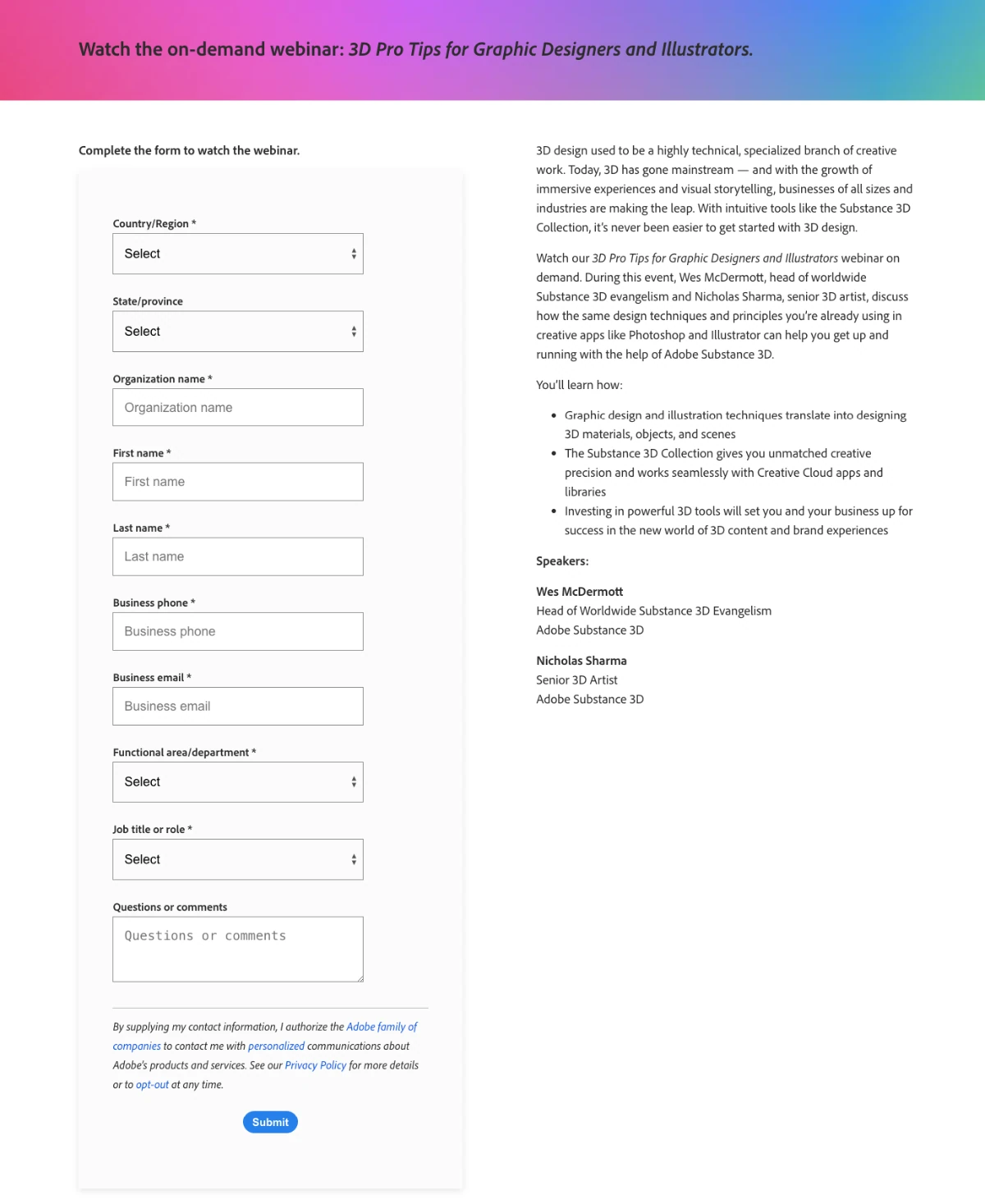
Example 10 – Adobe’s Webinar Landing Page for Creative Cloud Mastery
Overview Of Webinar Topic
This webinar example focuses on mastering Adobe Creative Cloud. It covers essential tools and techniques to enhance your creative projects, demonstrating how to leverage Adobe’s suite to maximize productivity and creativity.
Best Elements Of This Landing Page:
- CTA Placement and Messaging: The ‘Register Now’ button is prominently displayed. It creates a sense of urgency and guides visitors to take immediate action. The CTA messaging is clear, encouraging users to secure their spot in the live webinars.
- Unique Design Aspects: The webinar landing page template features Adobe’s vibrant branding and high-quality visuals, which capture visitors’ curiosity. The sleek design aligns with Adobe’s image, making the page visually appealing and professional.
- Conversion Rate Optimization Techniques Used: The prominent form asks for only essential visitor info such as name and email address. It ensures a smooth registration process. The use of bulleted copy highlights the clear value proposition, emphasizing the benefits of attending the webinar.
- Visual Content and Its Effectiveness: The visuals are both engaging and informative, providing relevant information about the webinar title and key discussion points. This not only attracts visitors but also gives them a clear understanding of what to expect, boosting webinar registrations.
By integrating these elements, Adobe’s webinar landing page effectively captures and retains visitor interest. It also optimizes for higher conversion rates and demonstrates a highly effective landing page for webinar registrations.
Tips for Creating Your Own Effective Webinar Landing Page
Below I have shared some tips that will help you craft attractive landing pages for your webinars.
i. Crafting Compelling Copy and Headlines
Begin with a headline that tells your audience what they’ll gain by attending your webinar. Use clear, benefit-driven language that addresses their needs or solves a problem. The copy beneath should support the headline by quickly explaining what the webinar is about and why it’s worth their time.
Keep it focused: every sentence should give the reader a reason to sign up.
ii. Using High-Quality Visuals
Visuals can make or break your landing page. Use images and graphics that complement your message and reinforce the topic of your webinar. Use a creative image assistant to speed up and simplify your visual design. They should be professional and relevant—think of them as visual aids that help tell your webinar’s story at a glance.
Good visuals can also direct attention to your call to action, increasing the likelihood of registrations.
iii. A/B Testing for Optimization
To find out what works best, test different versions of your landing page (A/B testing). Change one element at a time—like the headline, images, or call-to-action button—and see which version performs better.
This data-driven approach takes the guesswork out of page design and helps you refine the elements that are most effective in engaging your audience.
iv. Implementing SEO Strategies for Discoverability
Your landing page should be easy to find. Use SEO strategies for lead generation to improve your page’s visibility in search results. Research and include keywords that your potential audience uses to find webinars like yours.
Optimize your page titles, headings, and descriptions with these keywords. Remember, the goal is to be seen by as many relevant viewers as possible, which translates to more sign-ups.
Tools to Craft Your Own Webinar Landing Page
Creating an effective webinar landing page is easier when you choose the right tool. Here are three tools that can help you design, optimize, and launch your landing page with ease:
1. WPFunnels
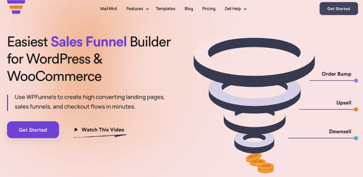
WPFunnels is a powerful tool specifically designed for WordPress users. It’s perfect for creating customized landing pages that integrate easily with your existing website.
Along with its drag-and-drop visual canvas, it offers a range of pre-built templates and elements tailored for webinars.
2. Leadpages
Leadpages is a popular choice for creating landing pages, and for good reason. It offers a wide range of templates and a user-friendly interface that makes it easy to design professional-looking pages.
It also provides tools for A/B testing, allowing you to experiment with different elements and find what works best for your audience.
3. Unbounce
Unbounce is another excellent option for building webinar landing pages. Known for its robust A/B testing capabilities, Unbounce lets you test various versions of your page to see which one performs better.
This tool stands out for its flexibility in design and optimization, making it a great choice if you want to dive deep into customizing your webinar landing page and refining it based on user data and feedback.
Each of these tools offers unique features and benefits, so consider your specific needs and level of expertise when choosing the right one for your webinar landing page. With the right tool, you’ll be well-equipped to create a page that attracts and converts your target audience.
Conclusion
Now that you’ve learned the essentials of crafting an effective webinar landing page, it’s time to put this knowledge into action. Use the insights and tools you’ve explored to build your own page, capturing the essence of your webinar and speaking directly to your audience.
To simplify this process, consider using WPFunnels to create your webinar landing page template. WPFunnels offers customizable webinar templates designed for optimal conversions.
Once your landing page for the webinar is live, continue refining it. Test different elements, gather feedback, and enhance your page to maximize registrations.
Start with WPFunnels today, and transform your webinar into a highly engaging and successful event. The possibilities are endless, and it all starts with your landing page.
** FAQs **
How to Write a Webinar Landing Page?
- To write an effective webinar landing page, start with a compelling headline that grabs attention. Follow with a brief overview of what attendees will learn and the benefits they’ll gain. Include speaker bios to build credibility. Use webinar landing page examples for inspiration, and ensure your call-to-action (CTA) is clear and prominent. Lastly, keep your sign-up form simple to capture new leads efficiently.
What is the Structure of a Webinar Landing Page?
- A webinar landing page template typically includes the following structure: a strong headline, a brief description of the webinar’s value, key discussion points, speaker information, a clear CTA, and a simple registration form.
What is the Landing Page of a Webinar Invitation?
- The landing page of a webinar invitation is a post-click landing page designed to provide detailed information about the webinar and encourage registrations. It should highlight the event date, topic, benefits of attending, and speaker details.
What is the Format of a Landing Page?
- The format of a landing page, especially for a webinar, should be clean and focused. Start with a headline, followed by a brief body copy explaining the webinar’s value. Include key points in a bulleted copy for easy reading. A prominent registration form and a strong CTA are essential. Look at webinar examples to understand effective layouts and designs.
How to Create a Landing Page?
- Creating a landing page for a webinar involves several steps: choosing a webinar landing page template, crafting compelling copy, and designing an intuitive layout. Use tools like WPFunnels to simplify the process. Focus on a clear value proposition, and ensure your CTA is easily noticeable. Constantly refine and test your page to optimize for conversions and attract inbound leads. want them to take. The effectiveness of a landing page can vary across different industries, often reflected in the conversion rates.

![Lead Generation vs Brand Awareness - Which One To Focus On [2026] 31 Lead Generation vs Brand Awareness - Which One To Focus On](https://getwpfunnels.com/wp-content/uploads/2023/12/Lead-Generation-vs-Brand-Awareness-Which-One-To-Focus-On.webp)
![Market Penetration Strategy - Actionable Guide For Beginners [2026] 36 Market Penetration Strategy](https://getwpfunnels.com/wp-content/uploads/2025/02/Market-Penetration-Strategy.webp)
![How To Craft An Effective Book Landing Page – Beginner’s Guide [2026] 37 Book Landing Page](https://getwpfunnels.com/wp-content/uploads/2023/12/How-To-Craft-An-Effective-Book-Landing-Page-Beginners-Guide.webp)
![Middle of The Funnel – How To Nurture And Educate Leads To Make A Purchase Decision [2026] 42 Middle Of The Funnel](https://getwpfunnels.com/wp-content/uploads/2024/10/Middle-Of-The-Funnel.webp)
![Top Of The Funnel - TOFU Content Marketing Strategy [2026] 47 Top Of The Funnel](https://getwpfunnels.com/wp-content/uploads/2024/08/Top-Of-The-Funnel-1.webp)
![How Do Marketers Use Geographic Segmentation? - Complete Guide [2026] 52 How Do Marketers Use Geographic Segmentation?](https://getwpfunnels.com/wp-content/uploads/2023/12/How-Do-Marketers-Use-Geographic-Segmentation.webp)