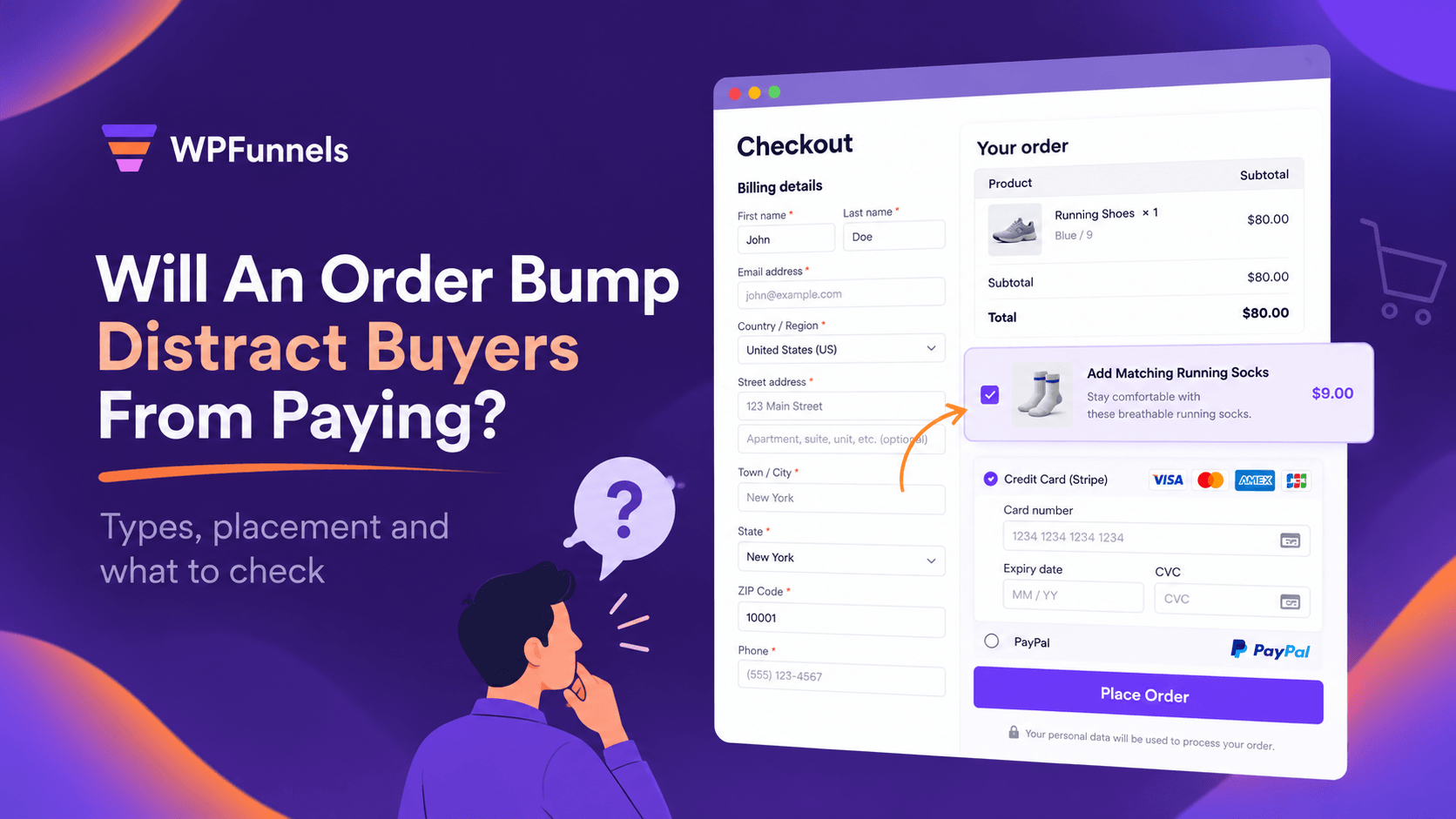

When adding an order bump at checkout, one question often comes to mind: Will this extra offer help me sell more, or will it distract buyers from paying?
It’s a fair concern. After all, your buyer is already at checkout, just one click away from placing their order. You want to offer them something extra, but you don’t want that offer to interrupt the buying process.
So, does adding an order bump mean you’re risking the sale?
Not necessarily.
An order bump can encourage buyers to add more to their order, as long as it doesn’t take attention away from the Place Order button.
But how do you make sure your offer helps rather than gets in the way?
Well, in this guide, we’ll share what we’ve learned from solving this problem and walk you through what to check before adding an order bump to your checkout.
Quick Answer: Three Things to Check First
First, the rule: The Place Order button should remain the most noticeable thing on the page. The order bump shouldn’t be bigger, brighter, or more attention-grabbing than the button.
Second, the position: Place the bump in the order summary, just above the products, where buyers can see it while reviewing their order.
Third, the offer: Keep it to one related item that costs less than the products in the cart and can be added in one click.
If you’ve got these three things right, the next thing to look at is the price.
TL;DR: The Whole Picture at a Glance
- An order bump can distract buyers when it’s louder than the Place Order button: bigger, brighter, more urgent, or when there are several bumps.
- A loud bump can do more than get ignored. Some buyers might click away to look at the bump product and never come back to complete their purchase.
- Check in this order: the rule, the position, the type of offer, then the price.
- A cheap, related add-on is a good starting point, like socks for someone buying running shoes.
- The often-quoted 30–40% take rate comes from one checkout platform’s own seller data, with no published method. Compare your results against your own checkout instead.
- Watch checkout completion first. Take rate tells you whether buyers want the offer, checkout completion helps you see whether it’s costing you sales.
First, Work Out Which Situation Are You In?
Pick the row that sounds most like your store. It tells you which check to start with.
| Where you are | What’s probably going on | Start with |
|---|---|---|
| You haven’t added a bump yet because you’re worried | No data yet, only the fear of distraction | Start quiet: one bump in the order summary, priced well under the item |
| You added a bump and checkout completion dropped | The bump is too loud, in the wrong place, or there’s more than one | The rule (check 1), then position (check 2) |
| You added a bump, and almost nobody took it | The offer doesn’t fit the cart, costs too much, or isn’t noticed | Type of offer (check 3), then price (check 4) |
| Desktop looks fine, but mobile sales dropped | The bump pushes Place Order out of view on a phone | Position (check 2) |
Start with scope. If checkout completion dropped right after you added the bump, check how it looks and where it’s placed. If checkout completion stays the same but hardly anyone takes the offer, look at the offer itself rather than its placement.
What Does “Distracting” Actually Mean On A Checkout Page?
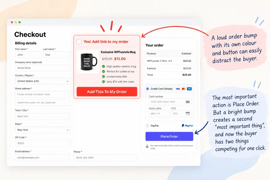
A checkout has one job: take payment for what the buyer has already chosen. Anything else on that page either helps with that job or asks for the buyer’s attention. An order bump becomes distracting when it asks for more attention than the Place Order button.
Steve Krug explains this idea in Don’t Make Me Think. On a page with a clear visual hierarchy, the more important something is, the more prominent it should be.
On a checkout page, Place Order is the most important button because that’s what the buyer clicks to complete the purchase. If the order bump is too loud, it can become a second thing competing for the buyer’s attention.
For example, a store might make the bump bright and colourful, sometimes even giving it a button with its own colour. A buyer might click through to look at that product, start browsing the shop, and forget they were halfway through checkout. In that case, the store could lose both the extra sale and the original one.
If you’d rather watch than read, our team made a one-minute video on exactly this question.
Quiet Bump vs Loud Bump: What The Buyer Actually Sees
Every bump sends two signals: what it offers, and how loudly it asks. The offer can be great and still cost you orders if the way it asks is louder than paying.
| Element | Quiet bump | Loud bump | What it does to the buyer |
|---|---|---|---|
| Size and colour | Smaller than the product list, one soft accent, small border | Bigger or brighter than Place Order, often with its own button | The eye goes to the bump before the button |
| Number | One | Two or three stacked | Paying turns into a set of decisions |
| Position | Just above the list of products | Between the form fields and payment | Interrupts the buyer mid-task |
| Offer | Cheaper than the cart and goes with it | Unrelated, or close to the main item’s price | Reads as a second purchase |
| Wording | Plain: what it is and what it costs | Countdowns, capitals, “last chance” | Creates doubt right before paying |
The table is the whole idea in one place. The rest of this guide shows how to check each row on your own checkout.
Where Do I Look When I Think My Order Bump Is Hurting Checkout?
Look in two places: the live checkout, the way a buyer sees it, and your order numbers. The first tells you what might be wrong. The second tells you whether it’s actually costing you.
I. The Live Checkout, As A Buyer Sees It
- Open your store in a private browser window, add your best-selling product to the cart, and go to checkout.
- Look at the page for two seconds. Note what your eye lands on first.
- Count the offers you see before Place Order.
- Note where the bump sits: above the list of products, between the form fields, near payment, or below the button.
- Tick the bump and check it’s added in one click, with no extra page or step.
- Repeat the same steps on your phone.
II. Your Order Numbers
- In WooCommerce, compare average order value for a few weeks before the bump went live and the same number of weeks after.
- Count the orders that include the bump product in the same period.
- In your store analytics, compare how many people reached checkout and how many finished, before and after.
If the live checkout looks fine and the numbers hold steady, your bump isn’t the problem. If either looks off, the next section shows which number to trust.
Are You Measuring The Right Number? Bump Take Rate vs Checkout Completion
When you add an order bump, there are three numbers you should keep an eye on.
- Bump take rate: The percentage of orders that include the bump. This tells you whether buyers want the offer.
- Average order value: Whether customers are spending more per order since you added the bump.
- Checkout completion: The percentage of people who reach checkout and complete their purchase. This helps you see whether the bump might be distracting buyers.
Here’s why checkout completion matters so much. One store owner on r/woocommerce described a store getting around 700 orders a month, with an average order value of about $45.
Let’s say the store adds a $9 bump, and 15% of buyers take it. That’s an extra $945 a month.
Now, suppose 3% of buyers leave checkout without completing their purchase because of the bump. That’s 21 lost orders, worth $945 in revenue.
So, even though the bump has a healthy take rate, the extra revenue could be wiped out by the lost sales.
You should also be careful with take rate benchmarks. SamCart says order bumps convert at 30–40% across its sellers.
But ElasticFunnels points out that there’s no independent benchmark and that the figure was published without a method. The important thing to understand is that a bump can have a high take rate while checkout conversion goes down.
So, don’t chase someone else’s take rate. Compare your results with your own checkout performance before you add the bump.
If the take rate and average order value go up while checkout completion stays steady, the bump is looking good. But if checkout completion drops, check whether the bump is distracting buyers, regardless of its take rate.
In What Order Should You Check Your Order Bump?
Check these four things in order. The first two help you see whether the bump is competing with the Place Order button. The next two help you understand whether buyers want the offer.
- The rule. Is Place Order still the most important thing on the page, or is the bump bigger, brighter, or one of several offers?
- Position. Is the bump where buyers naturally look, or is it interrupting the checkout form?
- Type of offer. Is the bump related to what’s already in the cart, or does it make buyers stop and think?
- Price. Is it priced like an add-on or more like a second purchase?
Now, let’s go through each one.
1. Is Place Order Still The Most Important Thing On The Page?
This is where a lot of distraction can happen. The rule is simple: Place Order should remain the most important thing on the page. If someone looks at your checkout for two seconds, they should notice their order and the Place Order button before they notice the bump.
That rule also helps answer a few common questions. Should the bump use your brand colour at full strength? Not if the Place Order button uses the same colour. Should it have its own button? No, a checkbox is enough. Should you add a second bump? Not until you’ve checked that the first one doesn’t slow buyers down.
We would add one order bump, not three, and make it look like part of the order, not an ad.
Here’s a bad and a good version of the same bump:
- Bad: “WAIT! SPECIAL OFFER! Add this now before it’s gone!!” in a large red box with its own bright button.
- Good: “Add running socks to your order, $8” in a small box with a soft accent colour and a small border.
The bad version shouts for attention and can make buyers hesitate just before payment. The good version tells them what the item is and what it costs, so they can decide quickly.
Action Items For You
Is my order bump louder than my Place Order button?
- Compare the bump’s colour with the Place Order button. The button should be stronger.
- Check the bump has a checkbox, not a button of its own.
- Compare the bump’s box with the product list. The bump should be smaller.
- Count the offers before Place Order. There should be one.
- Read the wording out loud and remove capitals, countdowns, and “last chance.”
How to calm down a loud order bump
In your order bump settings, switch off every bump except the one that fits most carts. Choose the simplest layout your tool offers, use an accent colour that’s softer than your Place Order button, and rewrite the headline to say what the item is and what it costs. Make sure buyers can add the item with one click. If they have to take extra steps, the bump becomes a task instead of a simple choice.
Quick Answer
Can I use my brand colour on an order bump?
Yes, as long as the Place Order button stands out more. If that button already uses your brand colour, use a lighter shade for the bump and give it a simple border instead. When buyers glance at the checkout, they should notice the Place Order button first and the bump second.
2. Where Should The Order Bump Sit On The Checkout? H3
Put the bump just above the list of products in the order summary. That’s where buyers already look to confirm what they’re buying, so an add-on there reads as part of the order.
A slight colour change and a small border help show that it’s an optional extra, not another step they have to take.
Other placement guides recommend a similar area:
- Thrive Themes points to the order summary.
- CheckoutWC suggests starting next to the cart items if you’re not sure.
- When a reader asked about the best spot under their order bump tutorial, WPBeginner’s support team said they didn’t have a specific placement to recommend yet.
Here’s how we view the common positions if you’re worried about distracting buyers:
| Position | Where it shows | Our take if distraction is your worry |
|---|---|---|
| Above the list of products | Right above the products and total | Start here. It reads as part of the order. |
| Above the checkout form | Before the buyer has typed anything | Can feel like a detour before they’ve started. |
| Below the billing details | Between the form and payment | A reasonable second test once the first is measured. |
| Just above payment | Next to the card fields | Competes with paying. |
| Below Place Order | After the button | Quiet, but many buyers never scroll to it. |
This is our judgment, not a rule from any platform. Your own numbers will tell you what works for your store. If the rest of your checkout feels crowded too, our guide to checkout page layout covers the page around the bump.
Action Items For You
Is my order bump sitting where buyers already look? H5
- Open your checkout and find the bump.
- If it sits between the billing fields and payment, or below Place Order, note that the position might be a problem.
- Move it above the list of products, and change nothing else.
- Check the page on your phone too. Place Order should still be easy to reach without scrolling past the offer.
How to move an order bump above the list of products
Most order bump tools have a position setting. Look for an option that places the bump before the order details or above the order summary.
- If your tool only offers before or after the order details, choose before.
- If there’s no position setting, ask your tool’s support team where the bump can go.
Quick Answer
What if my order bump tool only offers before or after the order details?
Choose before. Before the order details puts the order bump just above the list of products, where buyers already check what they’re paying for, so it reads as part of the order. After puts it below the order total, right next to the payment section, where it competes with paying. Keep the colour light and add a small border either way, then preview it on a phone.
3. What Should The Order Bump Offer? The Types Of Order Bump H3
An unrelated offer can make buyers stop and think, and that’s where distraction can start. If you offer something random, buyers are less likely to take it. A related, cheaper item is easier to understand at a glance.
The rule we follow is simple: the bump should cost less than the main product and be related to it. Someone buying running shoes might need socks. Someone buying a microphone might want a pop filter.
That’s the test for every type of order bump: can the buyer decide without opening another page?
Here are the types that fit a WooCommerce checkout and how much each one asks of the buyer:
| Type of order bump | Example | What it asks of the buyer | Distraction risk |
|---|---|---|---|
| Related add-on | Socks with running shoes, a pop filter with a microphone | A quick yes or no | Low. Start here |
| More of the same | Two more of the same item at a lower price | “How many do I want?” | Low |
| Upgrade | A better version instead of the one in the cart | Rethink the choice they just made | Higher. Test later, if at all |
Related add-on. A small product that goes with the item in the cart. It’s the safest type because it completes the purchase instead of starting a new one.
More of the same. The buyer already wants the item, so the only question is how many they need.
Upgrade. A bigger or better version instead of the original. It can increase order value, but it also asks buyers to rethink their choice just before paying.
Action Items For You
Is my order bump offer related enough to what’s in the cart?
- List your three best-selling products.
- For each one, write down the one item a buyer is most likely to need with it. Your order history and support emails will tell you.
- Pick the item that fits the most carts and costs well below the main product.
How to swap in an offer buyers actually want
Change the bump product to the item from step 3. If your products are too different for one item to fit, set up a separate bump for each product line, so each buyer still sees only one related offer.
Quick Answer
What if my store sells things too different for one order bump?
Give each product line its own order bump instead of using one for the whole store. For example, someone buying running shoes sees socks, while someone buying a microphone sees a pop filter. That way, each buyer sees just one related offer, so the decision stays simple.
4. Should You Discount The Order Bump?
Usually, no. A cheap, related add-on is already an easy yes, so you don’t need a discount to make it work. What matters more is the price. Keep the bump well below the main item’s price so it feels like a small extra, not a second purchase.
For physical products, Thrive Themes suggests keeping the bump at roughly 10–25% of the main product’s price.
If you’re thinking about offering a discount, do the math first.
Let’s go back to the store getting 700 orders a month. A $9 bump taken by 15% of buyers brings in $945 a month. If you drop the price to $7, you’d need around 135 bump orders, or a 19% take rate, to bring in the same revenue. If the discount doesn’t increase the number of buyers enough, you’re giving up margin without gaining enough extra sales.
Action Items For You
Is my order bump priced like an add-on?
- Divide the bump price by the main item’s price.
- If it’s above about 25%, test a cheaper related item or a smaller quantity first.
- Before adding any discount, work out the take rate it needs to break even.
How to fix an order bump that costs too much
Swap in a smaller size or a cheaper related item before you reach for a discount. If you do add one, place a test order to confirm the discounted price shows in the cart.
Quick Answer
Will a discount make more buyers take an order bump?
Sometimes, but it only pays if the extra ticks cover what you give away. Dropping a $9 order bump to $7 means you need about 29% more bump orders just to break even. A cheap, related order bump rarely needs one, so start at full price.
How Do I Know Which Issue Is Hurting My Checkout Most?
Let your numbers guide you. Start with the issues that affect every buyer: how noticeable the bump is and where it sits. Then look at the offer itself.
| What your numbers show | What it usually means | Go to |
|---|---|---|
| Checkout completion dropped right after the bump went live | The bump is competing with Place Order | Check 1, then check 2 |
| Completion held, but the take rate is low | Buyers don’t want the item, or it costs too much | Check 3, then check 4 |
| Completion dropped on mobile only | The bump crowds the phone screen | Check 2 |
| Take rate and order value rose, completion held | The bump is working | Leave it alone |
If checkout completion was already low before you added the bump, the problem may be somewhere else on the page. Forced account creation is one common issue. Our guest checkout guide walks you through it.
How Long Before I Can Judge An Order Bump?
Give each change a few weeks so you can compare both weekdays and weekends. Compare the results with the same length of time before the change.
For a store getting a few hundred orders a month, we’d give it four weeks. A small drop can be easy to miss among the usual ups and downs. That’s our recommendation, not a published rule.
Change one thing at a time. If you move the bump on Monday and change the price on Wednesday, you won’t know which change made the difference.
Keep your sales calendar in mind, too. If you launch a bump during a Halloween or Black Friday sale, the sale itself could affect your numbers more than the bump.
Set it up a few weeks before the sale so you have a clean baseline to compare against.
What If The Bump Looks Right But Nobody Takes It?
Even if your bump is subtle and well-placed, few buyers may take it. Here are three things to check.
- The offer isn’t wanted. The item is related, but buyers may not need it with this purchase. Check your support emails and reviews. What do buyers ask about after their order arrives? That could give you ideas for a better bump.
- The price is too high. Compare the bump’s price with what the same item sells for on its own in your store.
- Buyers aren’t noticing it. If the bump is too subtle, try adding a soft accent colour or moving it from below Place Order to the order summary.
You can also ask an AI assistant like ChatGPT or Claude for ideas. Share your main product, the bump you’re offering, and its price. Then ask for three related bump ideas priced at less than 25% of the main product’s price. Pick the most relevant idea and test it.
How Can I Set Up A Quiet Order Bump Without Paying For It?
WooCommerce doesn’t have a built-in order bump feature, so you’ll need a plugin. There are plenty of plugins that let you add one, and the checks in this guide work with any of them.
If you run a WooCommerce store, you can use WPFunnels.
It’s a visual sales funnel builder for WordPress and WooCommerce. The free version lets you add one order bump per funnel, which is exactly where we’d start. You can also set the bump’s position to place it just above the order details, and you can set everything up without writing any code.
Here’s what you get with each plan:
| WPFunnels Free | WPFunnels Pro | |
|---|---|---|
| Order bumps | 1 per funnel | Multiple per funnel |
| One-click upsell after checkout | 1 per funnel | Yes, plus conditional offers |
| Offers based on what’s in the cart | No | Yes |
| Funnel analytics | No | Yes |
To set up a quiet order bump in WPFunnels, open your funnel’s Checkout step and add an order bump. Choose a product that’s cheaper than the main item and goes well with it.
Then pick a simple layout, set the position to Before Order Details, and use an accent colour that’s softer than your Place Order button.
The order bump guide and position guide walk you through each step.
Want to see how it’s done before trying it yourself? Here’s a walkthrough from our team.
If you already use another order bump tool, that’s fine. You can follow the same checks in this guide with that plugin, too. The main thing is to keep your bump less noticeable than the Place Order button.
Frequently Asked Questions
1. What if my bump is quiet but checkout completion still dropped?
Check what else changed in the same period, such as shipping costs, a payment method, a theme update or a sale. If nothing else changed, move the bump for a few weeks, then switch it off for a few weeks. Comparing the three periods tells you whether the bump is the cause.
2. Is an order bump the same as a one-click upsell?
No. An order bump sits on the checkout page and is added with a tick before paying. A one-click upsell appears after payment, on its own page. Bumps suit small, related items. Upsells suit bigger offers, because the main order is already paid.
3. Should I add an order bump before a big sale like Black Friday?
Add it a few weeks before, not during. That gives you a clean baseline to compare against, and time to fix anything that looks loud or crowds the phone screen. If you launch it mid-sale, the sale will move your numbers more than the bump does.
4. Do I need a specific plugin to follow these tips?
No. The rule, the position, the offer types and the price range work with any order bump tool on WooCommerce. You do need some plugin, because WooCommerce has no built-in bump, but which one is your call.
Final Thoughts
Adding an order bump isn’t the risky part. Making it louder than the button that takes the payment is.
One related item, priced well under the cart, sitting quietly in the order summary, asks for a single glance. Follow the checks above, and within a few weeks you’ll know whether it’s earning more from the buyers you already have.
If there’s one thing to take away, it’s this: whenever you change your checkout, look at checkout completion before you look at take rate. If buyers are still paying, the bump is doing its job.
Have a question about your own checkout? Ask it in the comments below.